The UCSF Site Builder is a Drupal-based turnkey template built and maintained by UCSF. It comes with a host of attractive features, including the ability to integrate with UCSF's events calendar, faculty and researcher profiles and news content. Best of all, it's free to use for anyone starting a UCSF site.
In fact, this entire site was made with the UCSF Site Builder. If you're looking for other examples, visit our showcase.

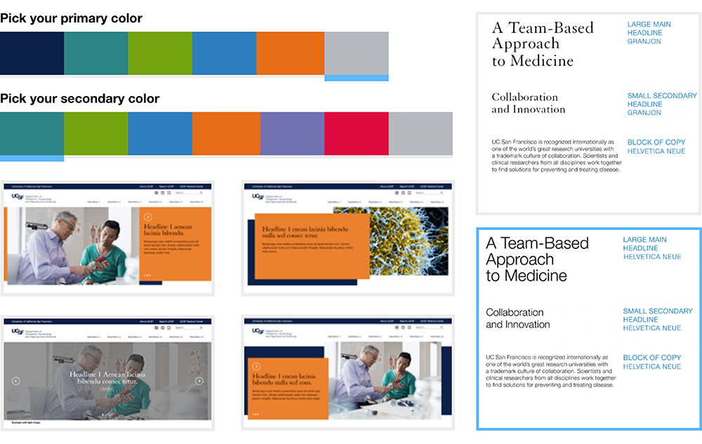
Customizable
The template comes with five different homepage splashes, a number of color combos, choice of font, sidebar styling, and left or right sidebar placement. Pages are built modularly and content can easily be shifted around to suit your needs.
Pull in a feed of news or events, create automatically updated profile pages, build a one-, two- or three-column layout, call out important quotes, add images or videos... it's all possible. Build each page exactly as you'd like it, each and every time.
Examples of customization options:

Branded
Our brand helps all of us — as part of the UCSF community — make a strong and lasting impression with supporters, patients, colleagues and students. Using a common visual identity helps to raise awareness and tell a more powerful and memorable story. It also builds associations that give audiences confidence that they are on an official and legitimate site.
Site Builder is created with fonts, colors and design elements to help you build a unique site that fits within the UCSF identity.
Secure
Websites aren't one-off projects. They require ongoing maintenance and updates to protect against hacking and corruption.
All UCSF Site Builder websites are updated and maintained by the Information Technology Services team, who will ensure that strict data security standards are met at all times.

Accessible
As a public institution, we have an obligation — both legally and ethically — to make sure our websites are accessible to all.
The UCSF Site Builder meets all WCAG 2.0 standards for web accessibility, which means it was built from the ground up to meet stringent accessibility rules. This includes important but often missed aspects, like color contrast levels and properly tagged navigation.

Responsive
The UCSF Site Builder was designed to look great on tablets, phablets, phones and desktops, regardless of browser or monitor size.
Columns will automatically stack when viewed on a smaller screen, images will become full-width, and fonts will adjust to ensure the best possible browsing experience, whatever device someone's using.

Evolving
Web standards change, and so do your needs.
The UCSF Site Builder will continue to develop as time goes on, giving you better ways to display and improve your content. If you have an idea of what you'd like to have, we can potentially add it to our development roadmap.